The combined net worth of Donald Trump’s 17 cabinet nominees (including Vice-President Mike Pence) exceeds $9.5 billion. That figure is greater than the combined net worth of fully a third of the American public, or the 43 million least-wealthy Americans. A political fact-checking website emphasized that while this comparison is factually accurate, it masks the reality that the vast majority of those 43 million Americans have zero net worth, suggesting any number of sets of 17 people could have net worth greater than the poorest citizens in this country.
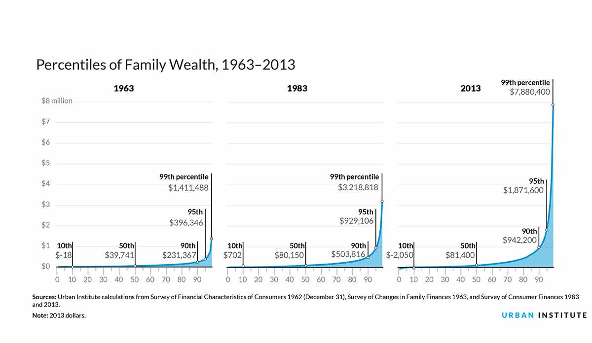
That fact check only serves to highlight the incomprehensible and unjust disparities in wealth in the United States. As the Urban Institute chart below demonstrates, inequity in wealth is not new, but the exponential increase in that inequity over the last 50 years is astounding.
Between 1963 and 2013, Americans in the 90th percentile of wealth increased their wealth four-fold, while those at the 50th percentile saw just a doubling of their wealth. Yet these changes seem moderate compared to the six-fold increase in wealth for those in the top 1% and the decrease from no wealth ($0) to negative wealth, that is debt (-$2000), experienced by those in the bottom 10% of the wealth distribution.
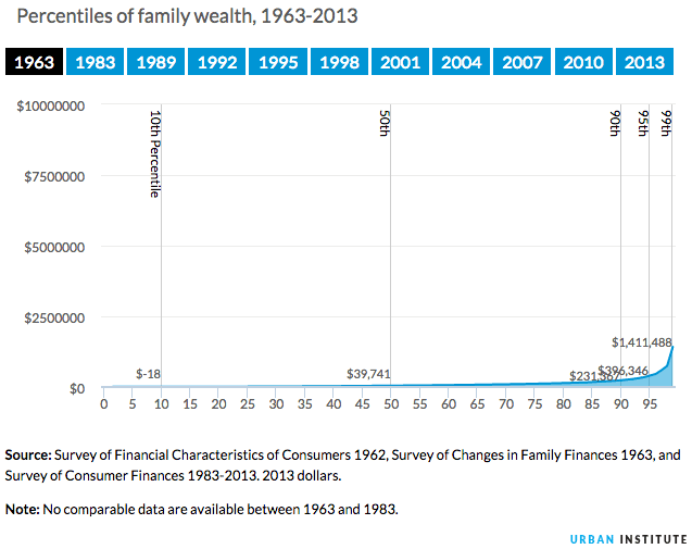
Databyte and motion graphic via Nine Charts About Wealth Inequality in America. Urban Institute.