Maps are functional tools that simplify our complicated world. At scale, they provide a bird’s eye view of human phenomena and reveal emergent patterns, behaviors, and dynamics. By combining data with geography, we uncover things about the places we live and work.
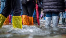
We see maps every day–turn on the local news or open a weather app on your cell phone. You are likely to see a simple map of your location and the average temperature for that day. Now, add some more data, and the map may tell you a different story. What will a map of high temperatures on a summer day and the neighborhoods with high numbers of older adult populations tell us? If we know that older adults are at a higher risk for heat-related illnesses, the map is helping us to identify a climate-related vulnerable population in a specific location. We call this vulnerability mapping.
In our research, we reviewed studies of climate events, like heat waves, that combined health data and location to visually explore how these events can harm individuals and communities. Our work recommends best practices to other researchers interested in creating vulnerability maps to better understand climate-related health outcomes and communicate this information to the public. After reviewing a large number of studies published between 2008 and 2018, we found 37 studies that used vulnerability mapping to examine health outcomes related to climate hazards. The hazards were grouped into four main categories: extreme heat, flooding, vector-borne disease, and wildfires.
By designing vulnerability maps in collaboration with communities, we can better picture vulnerability and increase our ability to adapt to and build resilience in neighborhoods where it is most needed.
About 70% of the studies we examined focused on extreme heat. Far fewer studies examined other climate hazards, pointing to a large gap in our spatial understanding of other climate-related health hazards. Additionally, the methods used in the studies varied widely. Some maps were created using simple overlays, like the example described above, where data are layered on a map to see where it overlaps. Other maps used sophisticated statistical methods, usually only available to highly-trained individuals.
These results suggest we need to broaden our examination of all types of climate hazards that may affect health and apply methods understandable to wider audiences. We were not surprised that few researchers had access to primary health data on individuals. Individual health data are protected, for good reason, and are aggregated to larger scales (like cities or zip codes). These protections limit our ability to accurately describe vulnerability at a fine scale (like neighborhoods or households).
The goal of the vulnerability mapping is to help public health agencies and communities understand the complex interactions between climate, people, and health. Maps are excellent tools for doing this, particularly when communities are involved in creating them. One key recommendation is for researchers to engage with individuals, communities, and organizations that represent the geographic areas and vulnerable populations. Involving stakeholders helps us make more accurate maps and provides first-hand information to localities that may not have been available otherwise. By designing vulnerability maps in collaboration with communities, we can better picture vulnerability and increase our ability to adapt to and build resilience in neighborhoods where it is most needed.
Photo by Praveesh Palakeel on Unsplash