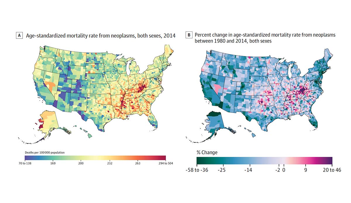
Although cancer mortality has declined by 20.1% across the United States since 1980, a few cancers are on the rise and clustered in particular counties. Ali H. Mokdad and colleagues gathered death records from the National Center for Health Statistics and the Census Bureau to measure exactly how and where cancer mortality changed between 1980 and 2014.
The map on the left shows 2014 county-level mortality for all cancers per 100,000 people, with red areas representing counties with the most cancer-related deaths. The highest mortality is clustered in the Midwest, the South, some counties in the Dakotas, and Alaska. The map on the right displays changes in mortality between 1980 and 2014. Counties experiencing decreases in mortality are represented in blue and green and those experiencing increases are pink and red.
Liver cancer mortality has grown by 87.6% with the largest increases in California, New Mexico, West Texas, and Alaska. Mortality for all other cancers has stayed the same or declined.
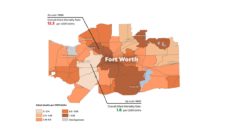
Understanding cancer mortality rates for specific counties, rather than national or state averages, allows prevention and treatment programs to be tailored to the needs of specific contexts and populations.
Databyte via Ali H. Mokdad, Laura Dwyer-Lindgren, Christina Fitzmaurice, Rebecca W. Stubbs, Amelia Bertozzi-Villa, Chloe Morozoff, Raghid Charara. Christine Allen, Mohsen Naghavi, Christopher J. L. Murray, Trends and Patterns of Disparities in Cancer Mortality Among US Counties, 1980-2014. JAMA Network.