Neighborhood redlining is by now a well-known example of how institutions built on discriminatory policies have shaped community health. Mortgage lending discrimination channeled investment and resources to White neighborhoods and prevented underserved communities, particularly Black Americans, from generating wealth.
Born out of the Great Depression, the Home Owners’ Loan Corporation (HOLC) was a federal program that bought out bank mortgages and helped homeowners refinance their homes. The HOLC created color-coded maps of metropolitan areas to help mortgage lenders assess the risk of financing properties. The maps marked areas green (“best”), blue (“still desirable”), yellow (“definitely declining”), or red (“hazardous”). The colors blatantly translated to race on a scale from White (green) to Black (red).
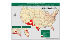
A team led by Jesse J. Plascak analyzed breast cancer outcomes between 2008 to 2017 among women ages 20 and up residing in New Jersey neighborhoods. The investigators grouped the women by race and ethnicity within the four neighborhood categories defined by the HOLC’s redlining maps. It looked at the incidence of breast cancer, the disease stage, and how aggressive the cancer was at diagnosis in relation to neighborhood.
Women in green, blue, and yellow neighborhoods diagnosed with breast cancer had lower odds of late-stage diagnosis, cancer aggressiveness, and death compared to those in redlined neighborhoods.
Among women with breast cancer living in yellow or redlined areas, 69% of all women in the study had a late-stage diagnosis, and 68% had an aggressive type of breast cancer. Over 25% of Black and Latina women with breast cancer lived in redlined areas compared to 12.5% of White women.
Women in green, blue, and yellow neighborhoods diagnosed with breast cancer had lower odds of late-stage diagnosis, cancer aggressiveness, and death compared to those in redlined neighborhoods. But these associations only appeared among White women.
Other research suggests members of a racial minority group who live in predominantly White neighborhoods report more experiences of interpersonal discrimination as the proportion of White residents in the neighborhood increases. The link between experiences of discrimination and adverse health outcomes might factor into the health disparities even in the green, blue, and yellow neighborhoods.
Studies about the health effects of redlining typically highlight the increased risk of many chronic diseases among people living in redlined areas. While poor breast cancer outcomes increased among residents in yellow and redlined areas, Plascak’s findings emphasize how housing discrimination confined health advantages to society’s privileged communities.
Even though redlining officially ended with the passing of the Civil Rights Act in 1968, housing discrimination did not die with it. Indirect redlining also exists through public school boundaries, zoning laws for real estate development, and public housing voucher allocations. All these factors isolate wealth and opportunity in specific areas. Unfortunately, cancer outcomes seem to follow maps as well.
Photo via Getty Images