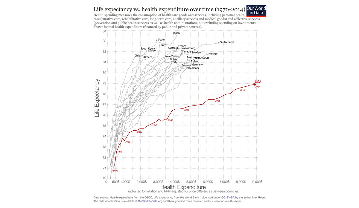
The United States spends far more on health than any other nation but does not have the health outcomes to show for it. The above graph from Max Roser of Our World in Data shows 23 industrialized nations that spend less on health per capita but still have greater life expectancy. Japan, who also has a population in the hundreds of millions, has the highest life expectancy in the world, while spending less than half per capita what the U.S. does.
We are not spending our money on the right things. As I wrote recently, the key to getting more health for our money is to reverse the balance of our health dollar that is spent on social services relative to medical care. Our goal shouldn’t be to cure sick people better, but to facilitate the achievement of health, which the World Health Organization defines as encompassing physical, mental, and social well-being.
Databyte and Interactive Photo via Max Roser, Link Between Health Spending and Life Expectancy: US is an Outlier. Our World in Data.