A January 2018 article in Health Affairs reports findings from a study that set out to identify areas in the United States with high numbers of deaths among Medicare beneficiaries.
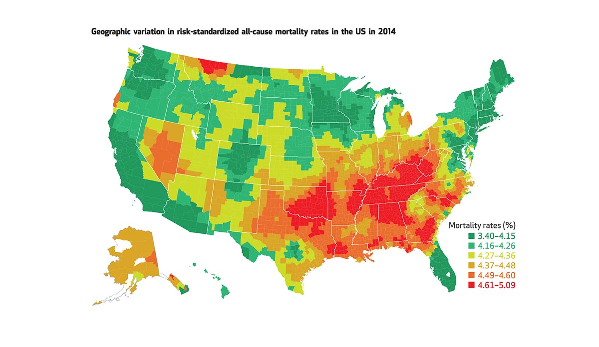
The figure above depicts 2014 mortality rates from all causes for Medicare enrollees aged 65 or older by county. Marked red on the map, the highest mortality rates were found largely in the Midwest and South. Additional high mortality hot spots were identified in northern Montana, Nevada, and small pockets of Alaska, Oregon, and Utah. Similar regional trends were reported in 1999, though overall mortality rates declined from 1999 to 2014.
Over fourteen million Medicare beneficiaries consider these 820 hotspot counties home. The study found that, compared to other areas in the country, these high priority areas have relatively more non-Hispanic White and Black residents with lower income and education levels, and higher unemployment rates.
This study is the first to provide a geographic breakdown of mortality rates among Medicare beneficiaries. Policymakers can use these important data for targeting resources to address poverty and other social drivers of health, improve health care quality for older adults, and reduce disparities.
Databyte via Harlan M. Krumholz, Sharon-Lise T. Normand, and Yun Wang, Geographical Health Priority Areas For Older Americans. Health Affairs.