Health Inequalities in Boston by T-Stops
Boston is a relatively healthy city, with a high density of physicians and world-class hospitals. But Boston also has some extraordinary differences, both in health indicators and in the drivers of those indicators within its borders.
Read Time: 3 minutes
Published:
Massachusetts has about 315 doctors per 100,000 people, more than 10 percent higher than the next closest state (Maryland). Much of this is due to a remarkable density of physicians and trainees in Boston itself. The state also spends more on healthcare than any other state and has the lowest percentage of residents without health insurance (4.4 percent). All of this might suggest that Boston would be a tremendously healthy city, a paragon of urban health. And, in many ways, it is.
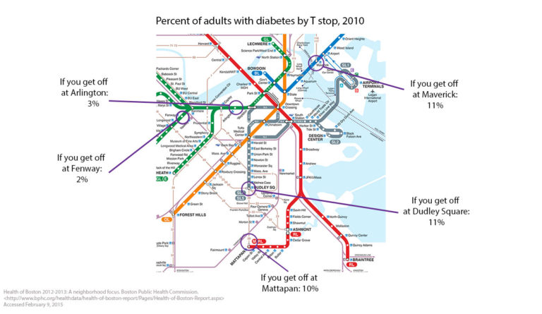
But, like many U.S. cities, Boston also has some extraordinary differences, both in health indicators and in the drivers of those indicators within its borders. It is then not surprising that there are similar differences, of similar magnitudes, for adult non-communicable disease indicators such as diabetes, as shown in the map above.
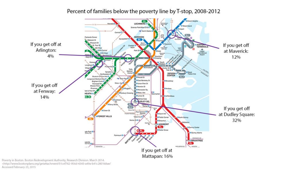
These health indicators are inexorably linked to a broad range of social indicators that are unevenly distributed across the city. Poverty is a frequently used summary indicator of socioeconomic position, well established as a marker of a broad range of other adversities. It is then not surprising, given the maps above, that poverty rates in some parts of Boston are four to eight times higher than those surrounding the healthier stops on the T .
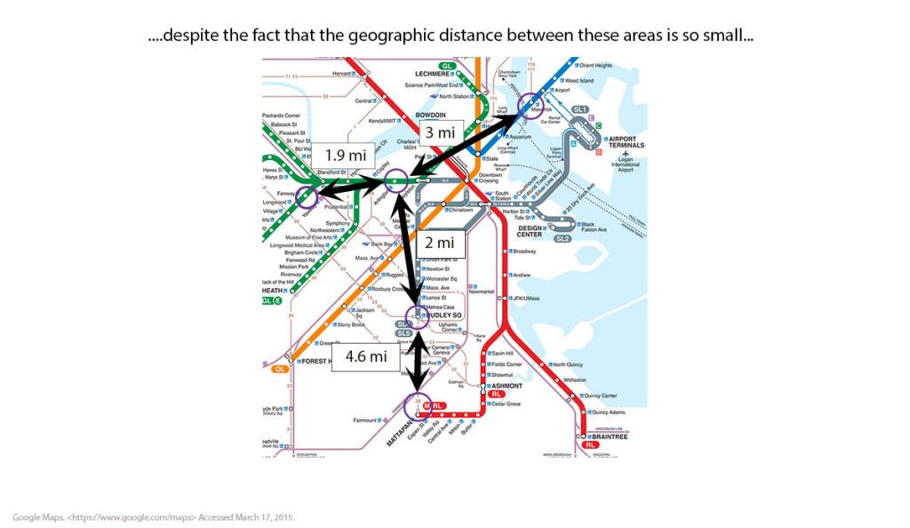
Inured as are to inequalities in health, we might well shrug off these health differences as ones between far-apart worlds. But are they? In fact, the geographic space we are talking about here is remarkably small. We are dealing with geographic differences of roughly four miles, or about an hour’s walk.
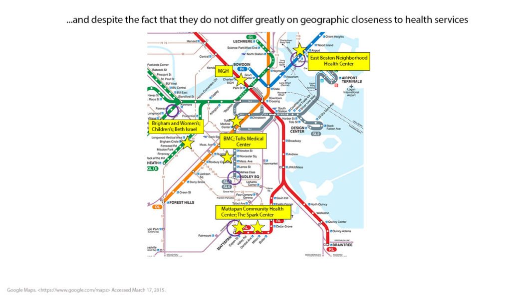
Rounding this out perhaps brings us back to the fundamental condition of Boston that we discussed earlier—the incredible density of physicians and hospitals throughout the city. It is therefore not surprising that none of the T stops we are discussing are particularly far from medical facilities. Clearly, medical centers differ in terms of populations served and variations in availability of care, but as the map below shows (and as can be verified through much more thorough analysis), there are negligible differences in physical distance of these neighborhoods to quality medical care.
This tells a story of a city richly characterized by top-of-the-line medical resources and overall health indicators that are enviably good, but that has, within it, substantial heterogeneity. The challenge to public health is apparent and vivid— how do we contribute to the generation of knowledge that can bridge these health gaps across a city like Boston? The goal of public health is to create conditions that produce health not just for some, but for all .
Editor’s note: An earlier version of this article was published in a Boston University School of Public Health Dean’s Note in March 2015