It appears to be a near certainty that the Affordable Care Act – at least as we know it – will soon undergo significant changes, if not be thrown out entirely. Republicans leaders, including President Donald Trump, have promised a swift repeal and replacement for the healthcare law – a prospect that is dubious at best. They have offered assurances that, despite sweeping changes to the health law, the millions of people who have become insured under the ACA will not lose their healthcare plans.
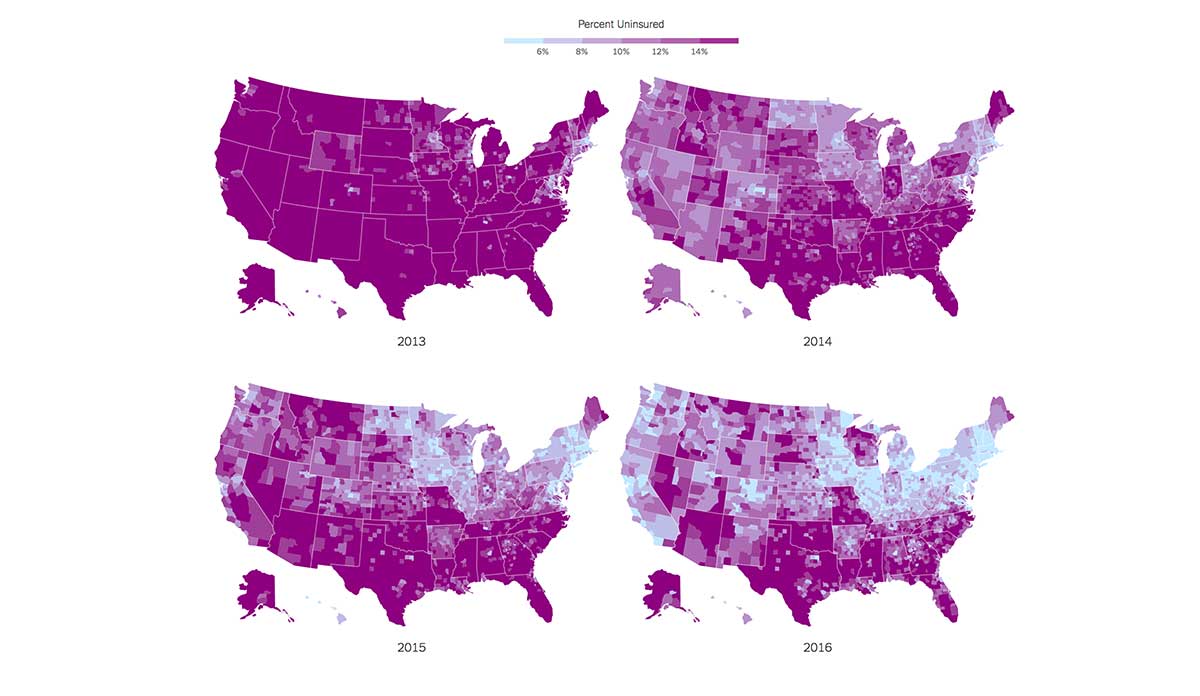
A recent graphic from the New York Times’ The Upshot blog shows just how much depends on Trump and Congressional Republicans keeping their word. These four maps show the reduction in the percentage of population without health insurance from 2013 to 2016 under the ACA. The change is striking, from over 14% across most of the nation in 2013 to less than 6% in many places as of last year. There are still some areas that have seen less of a reduction than others – particularly in the South and Southwest – a pattern that appears to be reflective of those state’s different decisions about Medicaid expansion.
Databyte via Margot Sanger-Katz and Quoctrung Bui, The Impact of Obamacare, in Four Maps. The New York Times.