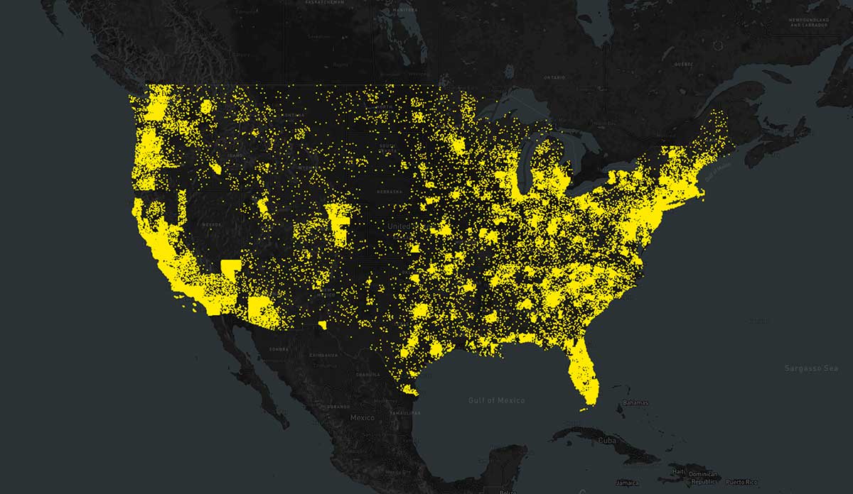
Each January, volunteers gather in communities across the United States. They head out to the streets to count the number of sheltered and unsheltered people experiencing homelessness on a single night.
In 2010, the Obama administration released the Opening Doors: Federal Strategic Plan to Prevent and End Homelessness with four main goals. The 2016 annual Point-in-Time (PIT) estimate produced that January shows just how close, or far, the United States is to reaching these goals.
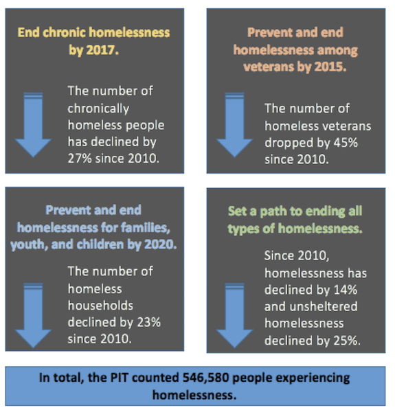
Photo via 2016 AHAR: Part 1 – PIT Estimates of Homelessness in the U.S. US Department of Housing and Urban Development.
Understanding Homelessness tells this important story through interactive visualizations (see above), with an aim to fend off stigma and misconception about homelessness. They acknowledge the individuality of each homeless person counted by representing them as a single dot, repositioning and coloring them according to geography, economic factors, and social considerations to reveal insights about the challenges of homelessness. Click through to see the interactive data from Understanding Homelessness.
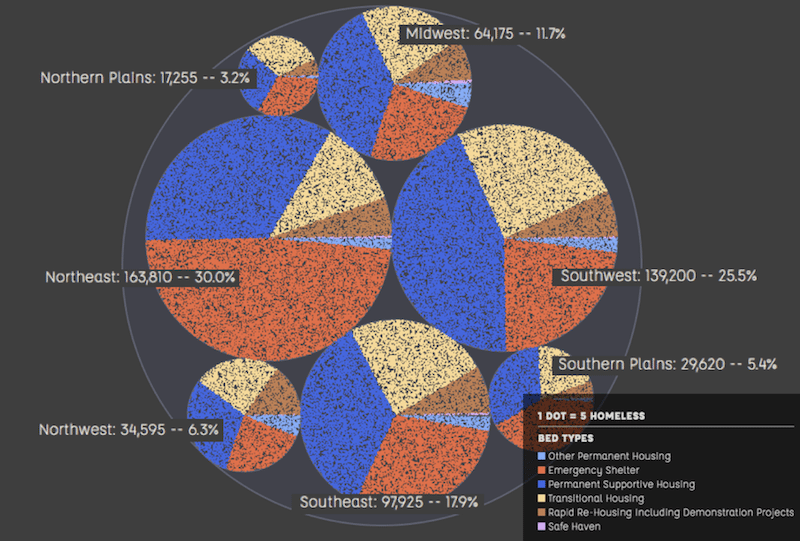
Databyte and Circle Chart Photo via Explore the Data. Understanding Homelessness. 1 Dot = 5 Homeless.