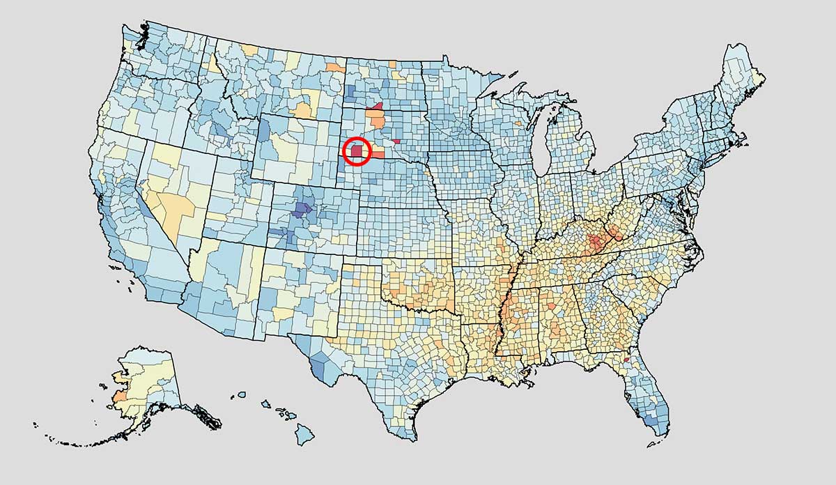
Health is largely shaped by where you live and the conditions of your life. The above map of life expectancy in each US county dramatically illustrates this point. The national life expectancy is 79.08 years, though someone can be expected to live thirteen years fewer or four years more depending on where they live.
A map of poverty would look very similar, suggesting there is a tight link between poverty and health. Take for example Oglala Lakota County, South Dakota (circled) which has both the lowest median family income ($26,029) and the lowest life expectancy (66.81 years) in the nation. The prevalence of diabetes is 27.72%.
By contrast, Fairfax County, Virginia has the highest life expectancy in the nation at 83.73 years and is among the top 10 richest counties in the United States with a median family income of $128,596. The prevalence of diabetes is only 10.6%.
This is just one comparison between two counties, but if you play with the interactive map you’ll notice a clear pattern that people in poor areas are sicker and die younger. Recognizing the connection between poverty and health can and should influence resource allocation policy to effectively help people in dire need.
Databyte via US Health Map. Viz Hub Health Data.